A visitor reaches the end of a service page and finds several invitations: call, book, request a quote, subscribe, download a guide and create an account. The business is trying to be helpful. The customer has to decide which route matches their situation before they can move forward.
A clear call to action makes that decision easier. It connects what someone has just learned with a sensible next step. The aim is not to push every visitor into a form. It is to help the right person act with an accurate understanding of what will happen.
The problem: business goals and page goals get mixed together
A business may want more sales, a stronger mailing list and fewer administrative calls. Those are different goals. Asking one page to promote every possible action can make them compete for attention.
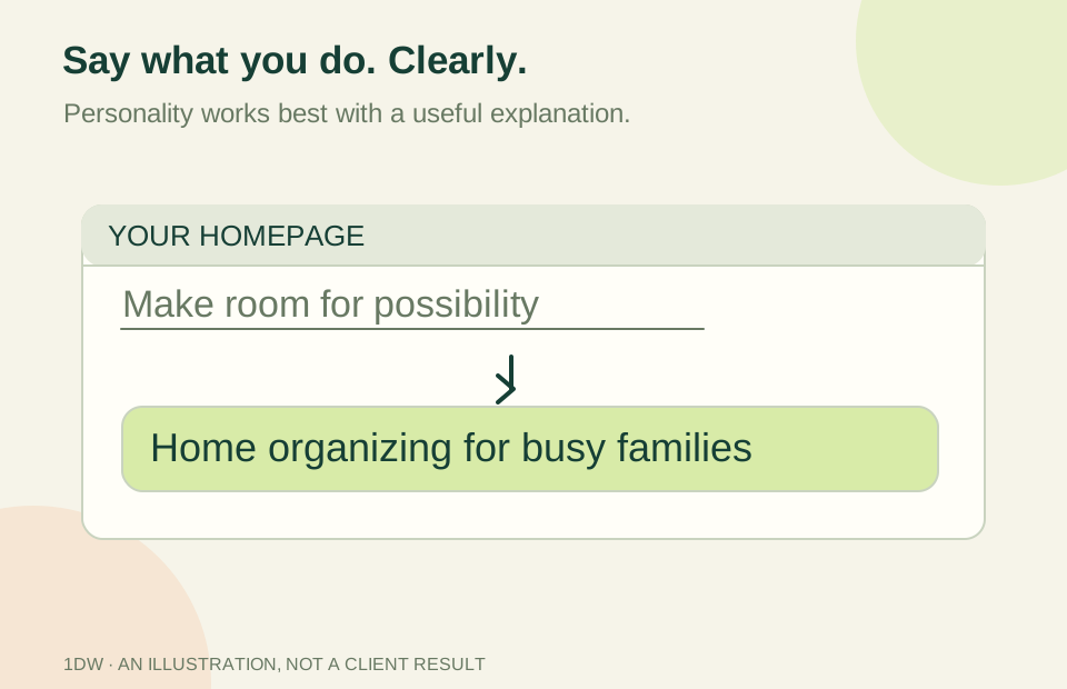
Button wording can add uncertainty. “Get Started” might mean a free conversation, a paid subscription or a long application. A customer should not have to click merely to discover the nature of the commitment. The page should provide enough context before the action.
Why it matters
People arrive at different stages. Someone comparing services may need an explanation or example before requesting a quote. A returning customer may already know what they need and want a direct contact route. Treating both visitors as ready to buy can make the website less useful.
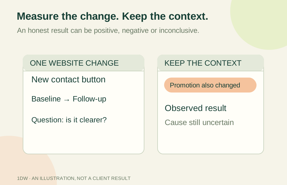
Clear actions also help the business interpret results. A click to call shows an intention to contact; it does not prove a conversation happened. An appointment request is not a confirmed appointment. Defining the step honestly makes both communication and reporting more reliable.
The solution: connect readiness with a task
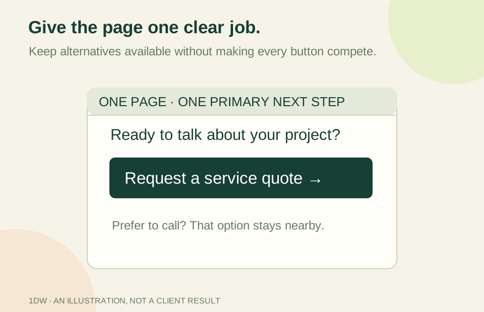
For a hypothetical restaurant offering private events, the main service-page action might be “Ask about a private event.” The nearby explanation can identify the details needed for an initial response and clarify that submitting the form does not reserve a date.
The restaurant's ordinary opening hours and phone number still matter. They do not need the same visual emphasis as the page's main event inquiry. A primary action creates a hierarchy; it does not require removing every alternative.
Place the action where it follows a useful answer. Someone may need to understand the service, minimum requirements or examples first. Repeating the same primary action farther down a long page can help, provided the page does not become a wall of competing buttons.
Four practical recommendations
- Finish this sentence for each key page: “After reading this, a suitable visitor should be able to…” Use an action a customer can take, not an internal aspiration such as “increase engagement.”
- Name the commitment. Try labels such as “Request an estimate” or “See the service options” when those describe the destination accurately. Put important conditions beside the action.
- Check the destination. A quotation button should not unexpectedly open a generic form with no reference to the service. Preserve useful context without exposing personal information in a URL.
- Define what success means. Record the difference between a click, a completed request, a qualified opportunity and a paying customer. Compare the measure that relates to your actual goal.
If a customer needs a different route, make it available in a quieter, understandable way. Good hierarchy should reduce confusion, not trap people in a single process.
How 1DW approaches it
The Smart Brief asks about business objectives and useful customer actions so a design can reflect the service being offered. Existing brief and review tools help record those decisions. A plan selection or free preview request does not by itself authorize paid work, a booking or a launch.
For a managed website, clearer labels and links may qualify as small edits within the agreed scope. A new landing page or custom workflow needs its own review and approval. Analytics can help assess a change when it is configured and consented, but a preview or a new button is not proof of better conversion.
Your next step
Choose one service page and write down its primary customer action. Ask someone unfamiliar with the business to explain what they expect after clicking. If their expectation differs from your process, improve the wording or surrounding explanation before adding another button.